
Welcome to the Design Portfolio!


The title of the campaign is His Helping Hands of Hope, referencing being the hands and feet of Jesus. The purpose of the campaign is to share the hope of Jesus with those in our community by coming alongside foster and adoptive families and meeting practical needs. The campaign hopes to create positive change and future hope for these kiddos and families, and a meeting of practical needs so that adoptive and foster families know they are not alone. The campaign asks the audience to join in on practical need meeting activities for foster and adoptive families, such as house and yard work, babysitting, bringing meals, etc.
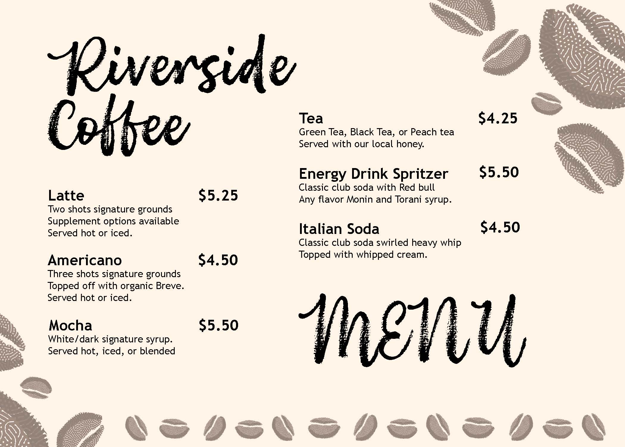
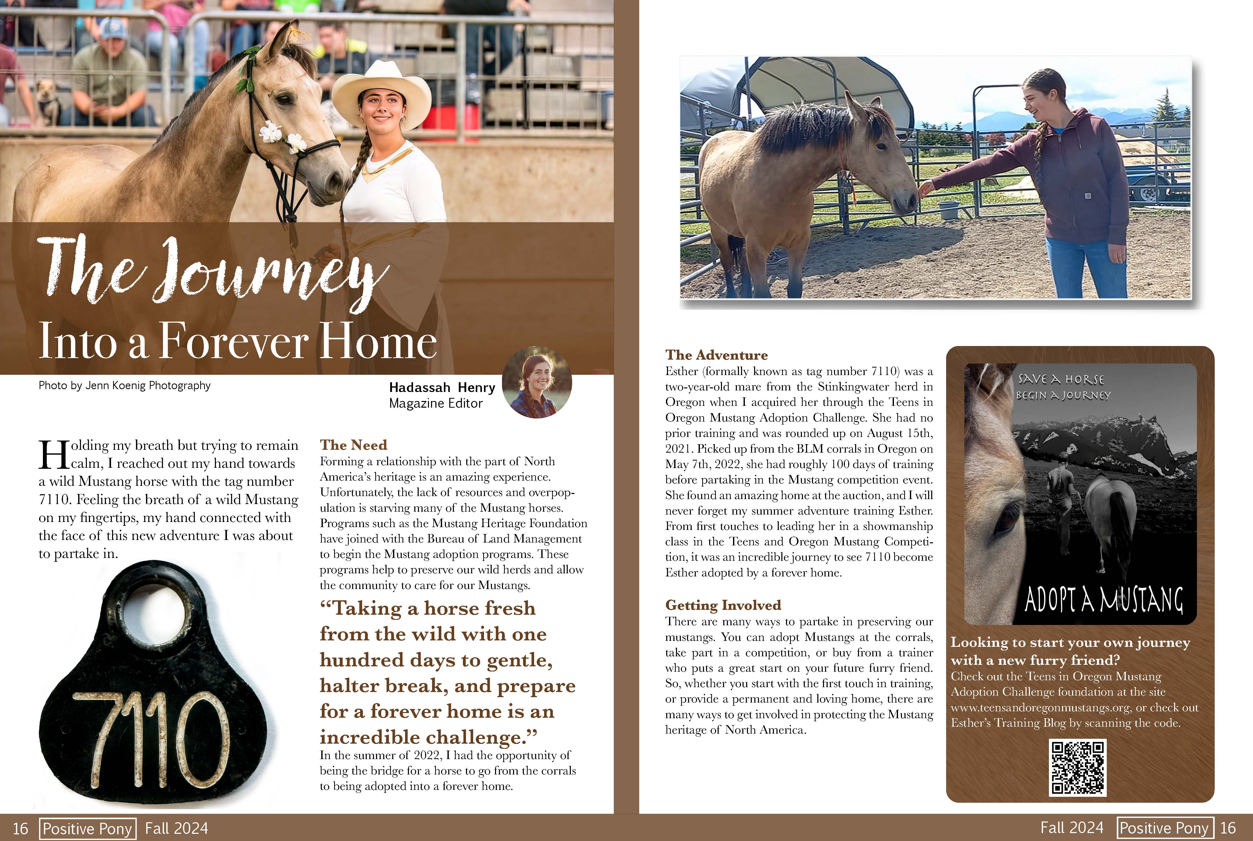
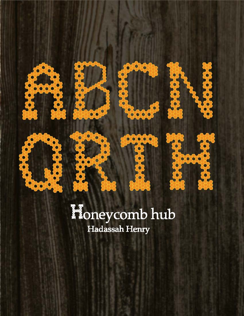
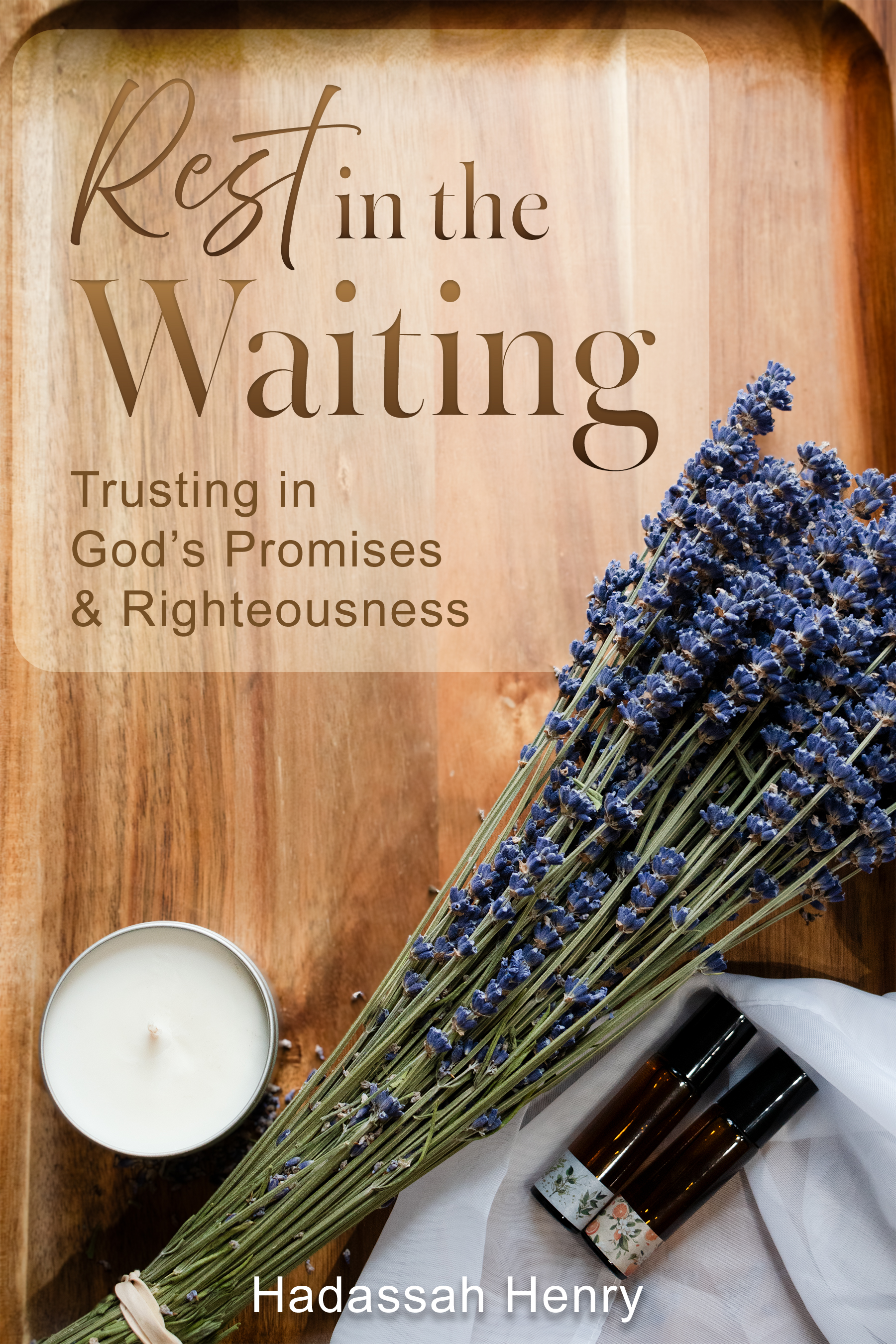
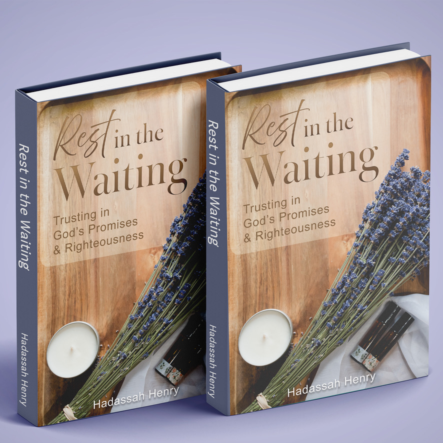
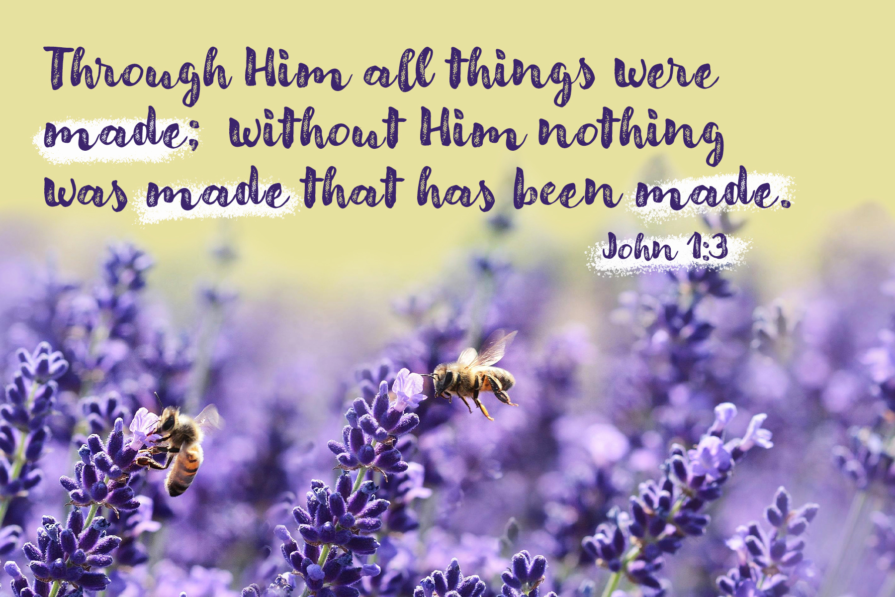
These are projects done during Liberty University, focusing on alignment and the interaction of type with imagery. The menu, magazine spread, book cover, typeface building project, and scripture design all pushed me as a designer to grow in visual hierarchy and typeface pairing.

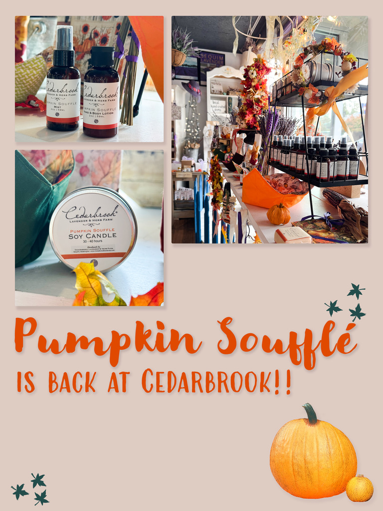
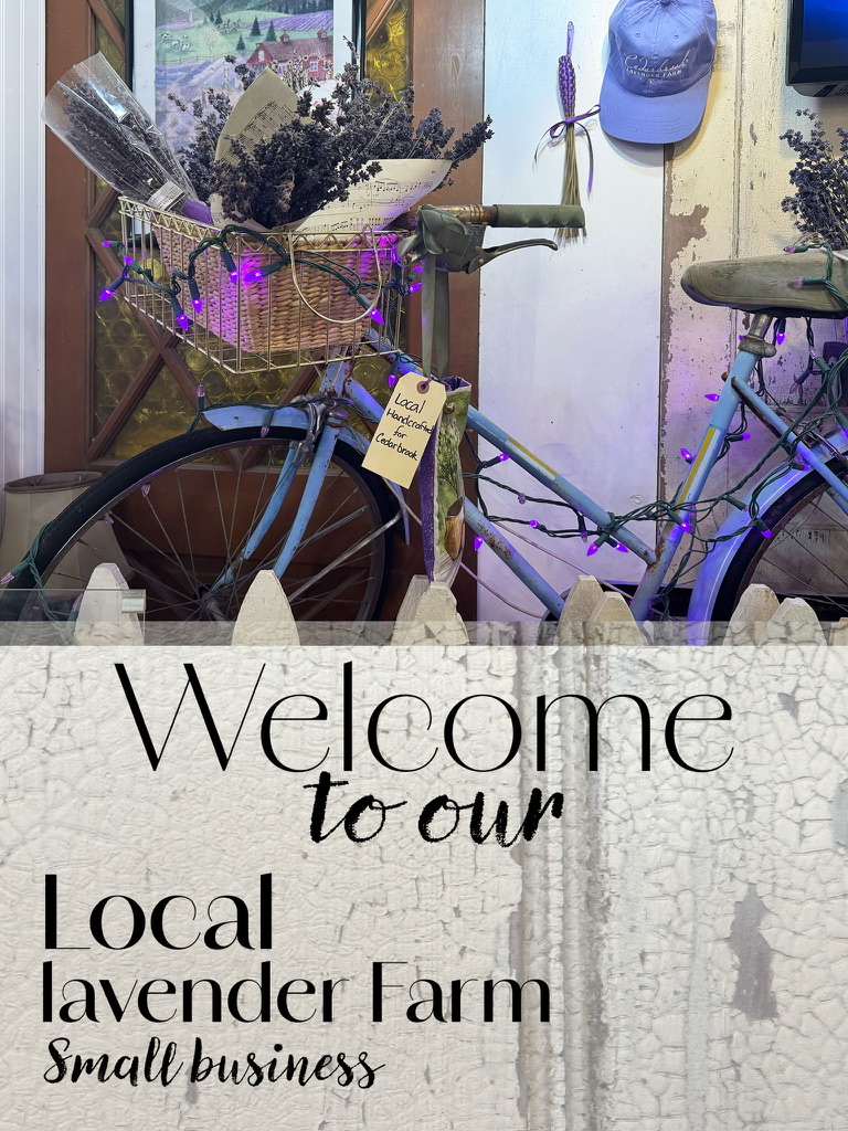
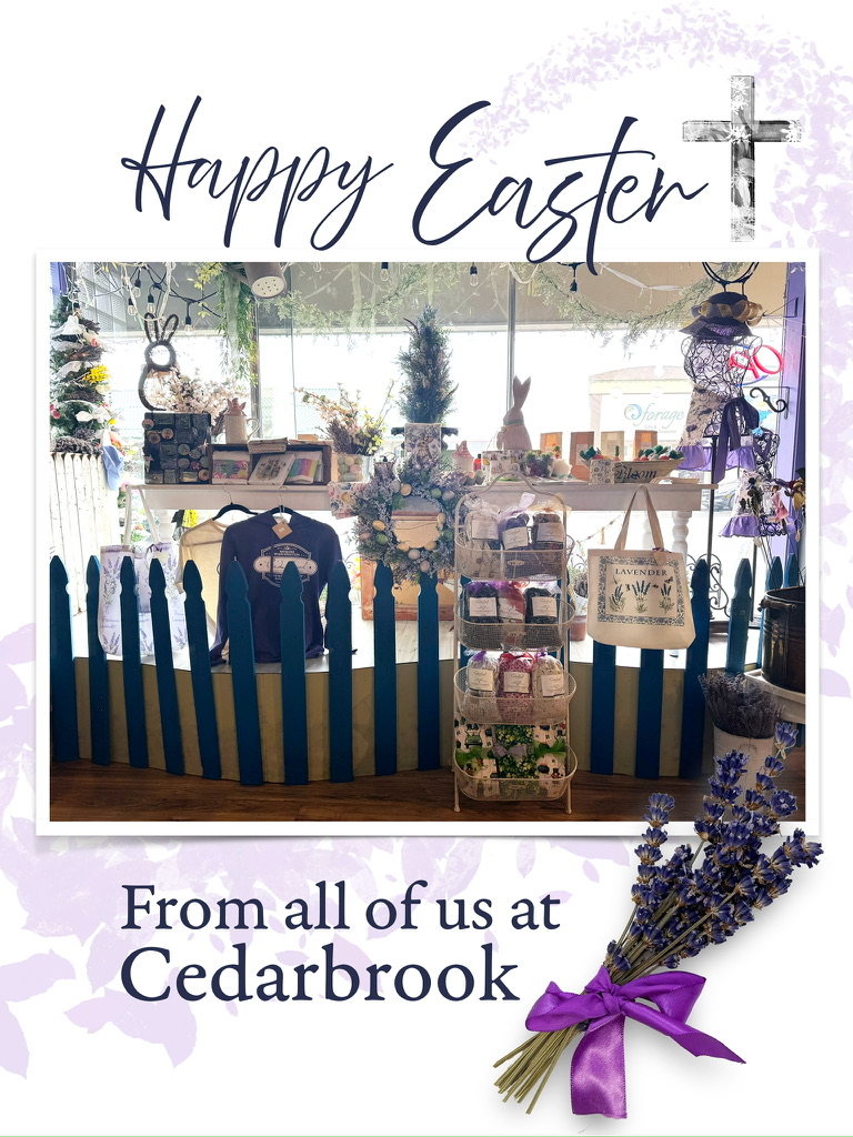

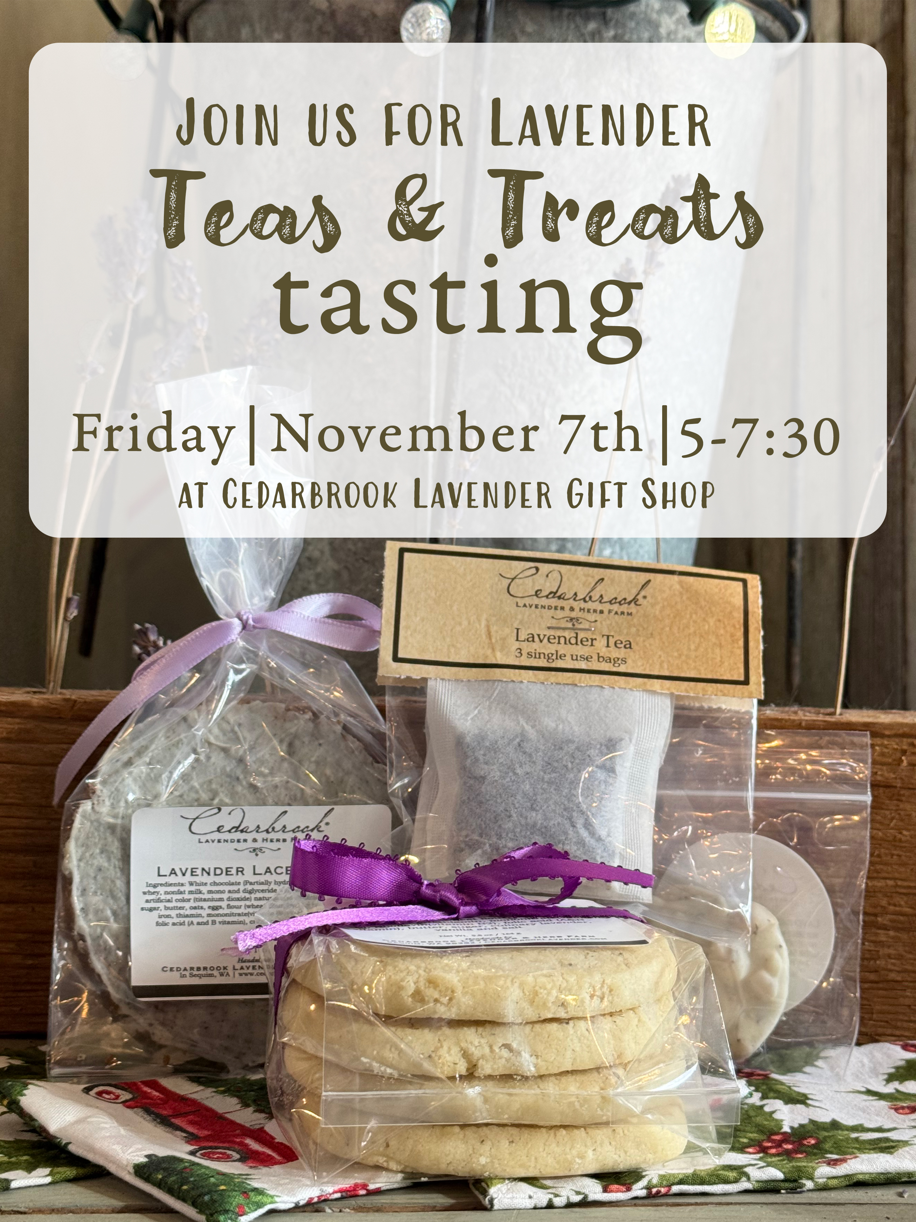
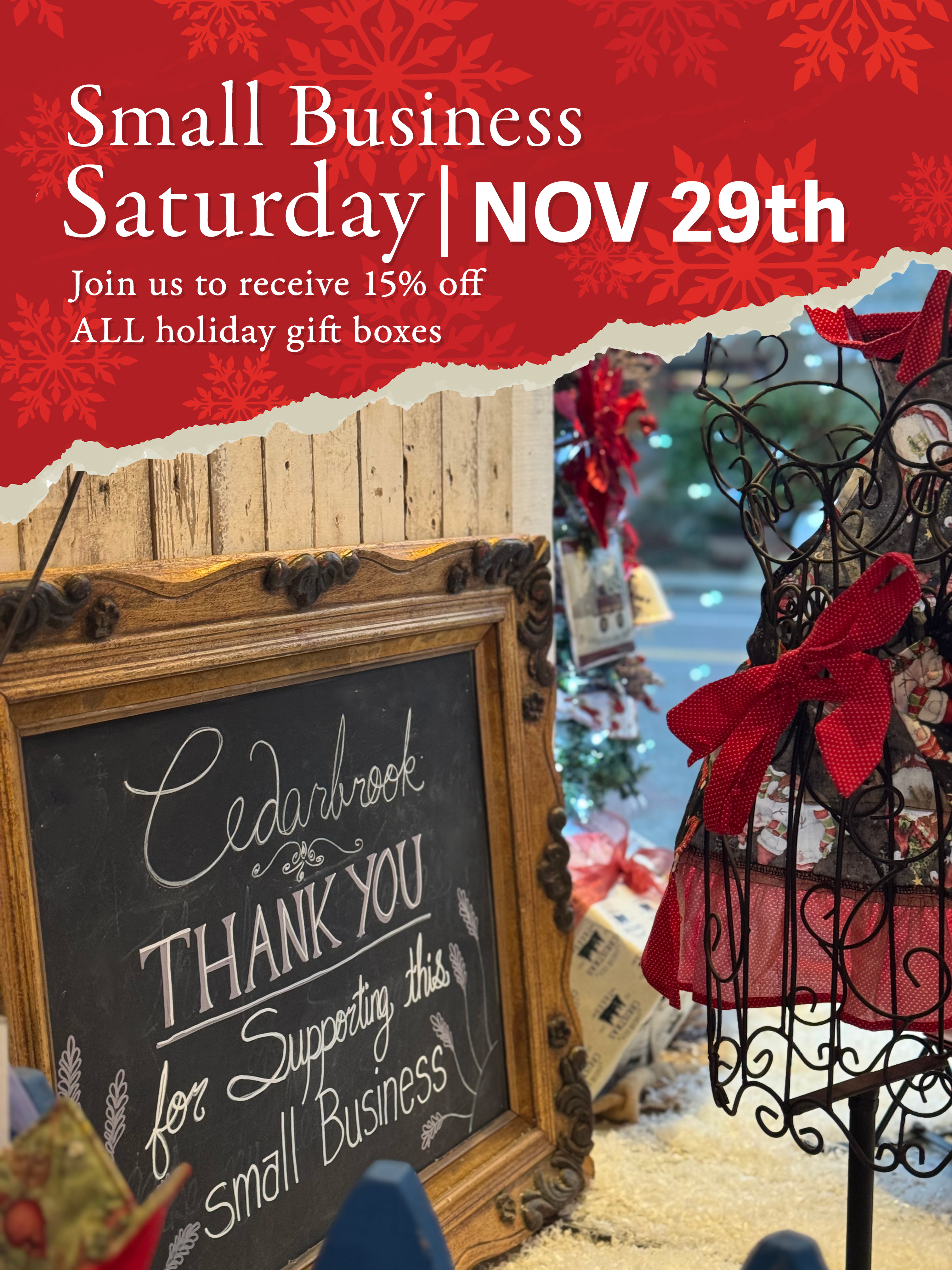
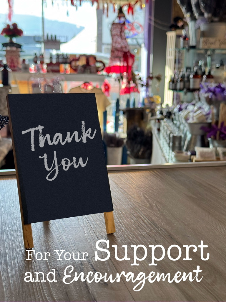

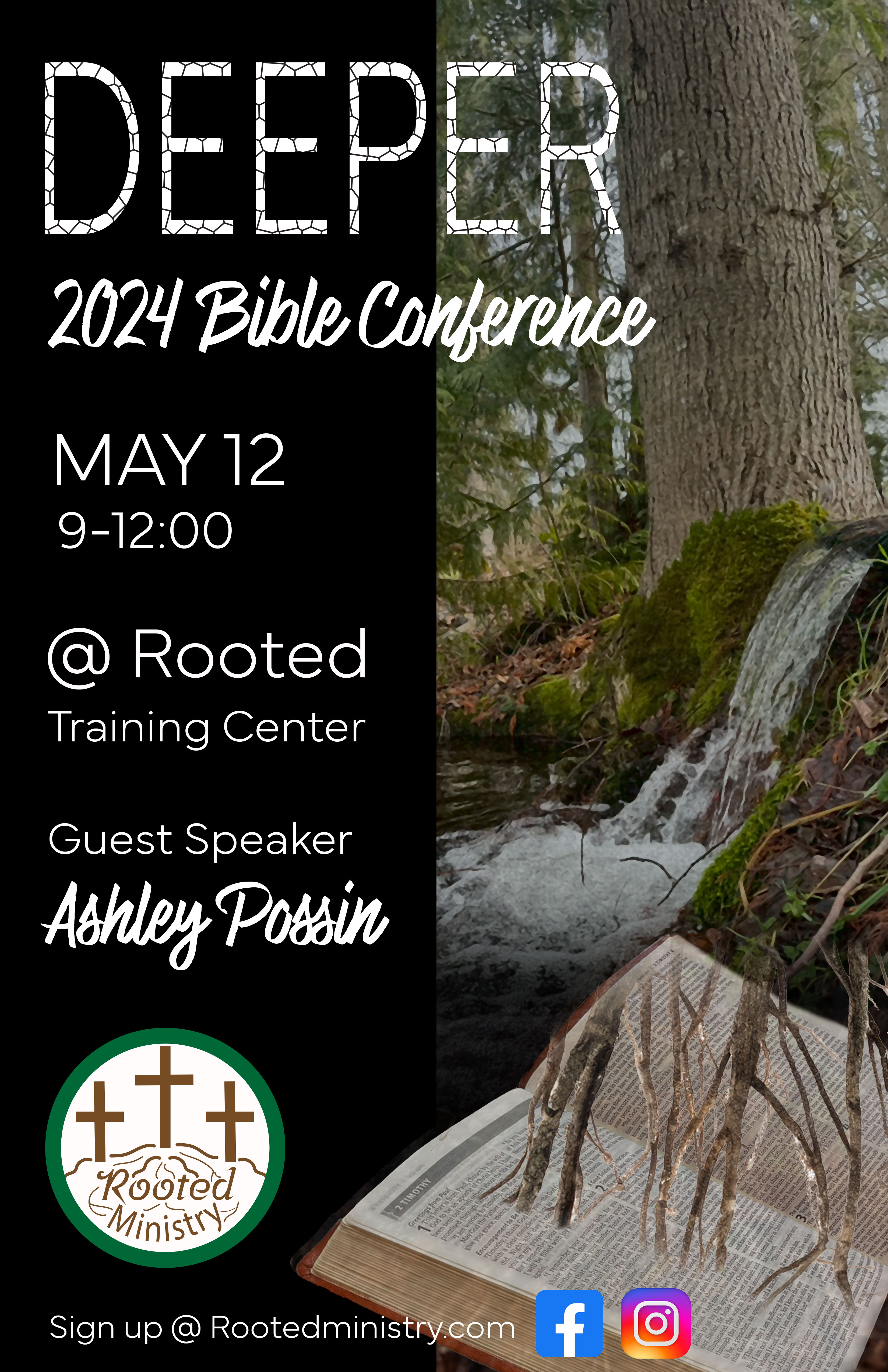

These are social media graphics, some designed for a local small business, and others for Liberty University courses. Whether about lavender, horses, or Bible conferences, these designs were created to call viewers to action with imagery and typography choices.
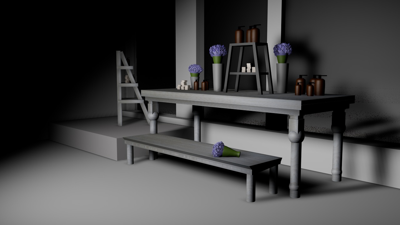
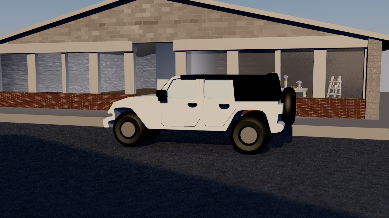
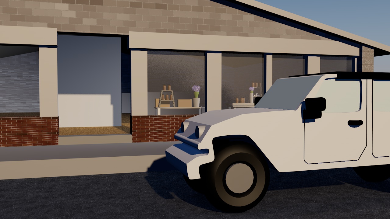
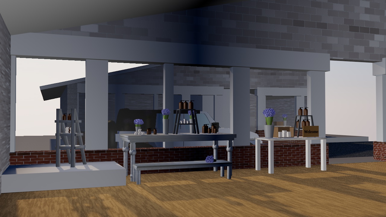
This animation was created in Intro to 3D animation in the spring of 2026! It is a quick tour of a gift shop I was blessed to work for the last couple of years. The project was created over eight weeks, and each week we had to build more of the objects that went into the animation model. Rendering out the video was pretty tough on my computer, but it was a great learning experience!


These are the illustrations created for Jane Austen’s Emma for Interactive Publication Design through Liberty University. During the eight weeks we learned how to create an Epub and designed custom illustrations and a cover design for the book. I love Jane Austen’s works, and enjoyed creating water color paintings for the illustrations. After taking photos of the art, I took them to photoshop and added a flair of typography to add significance of the parts of the story each illustration represents.
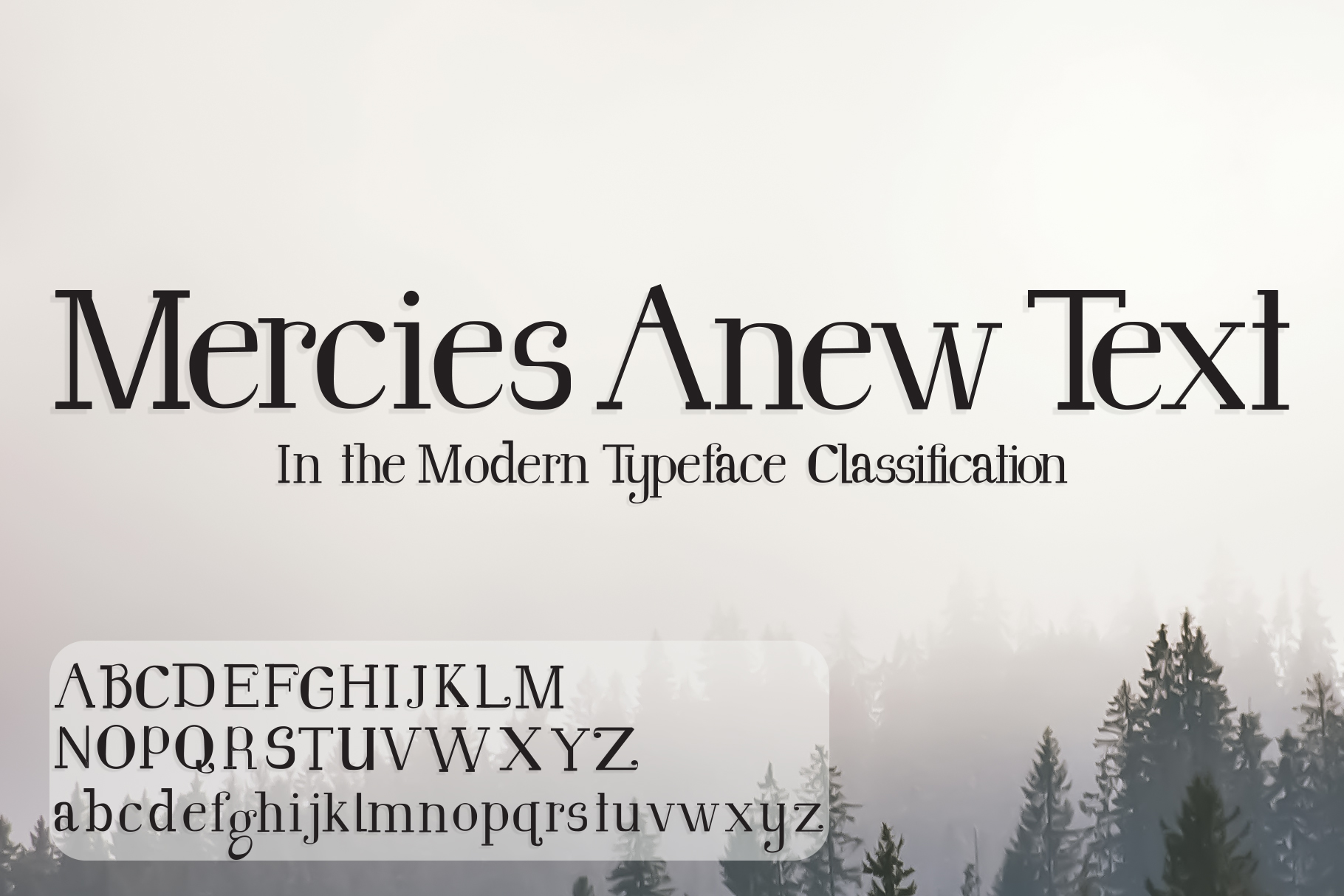
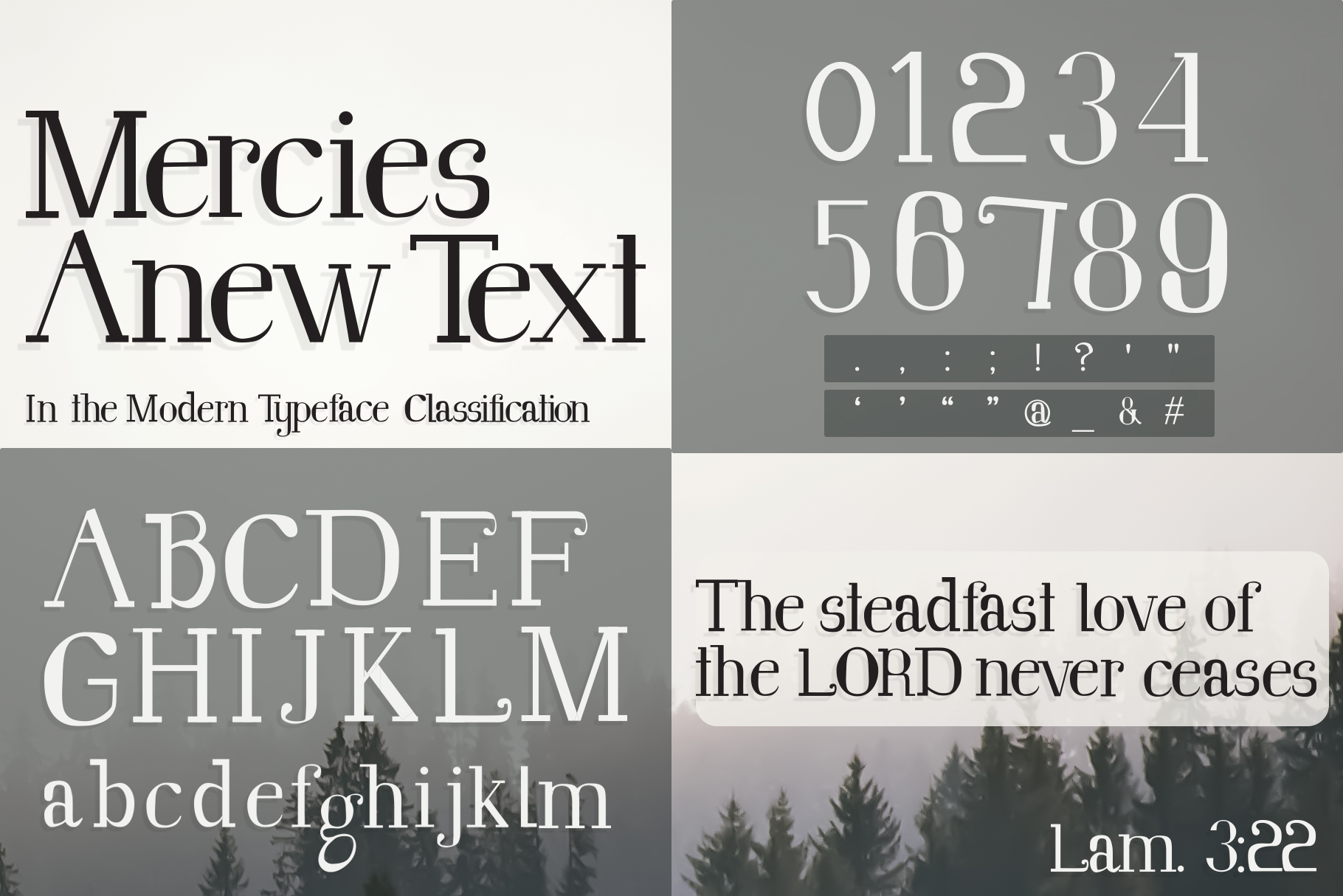
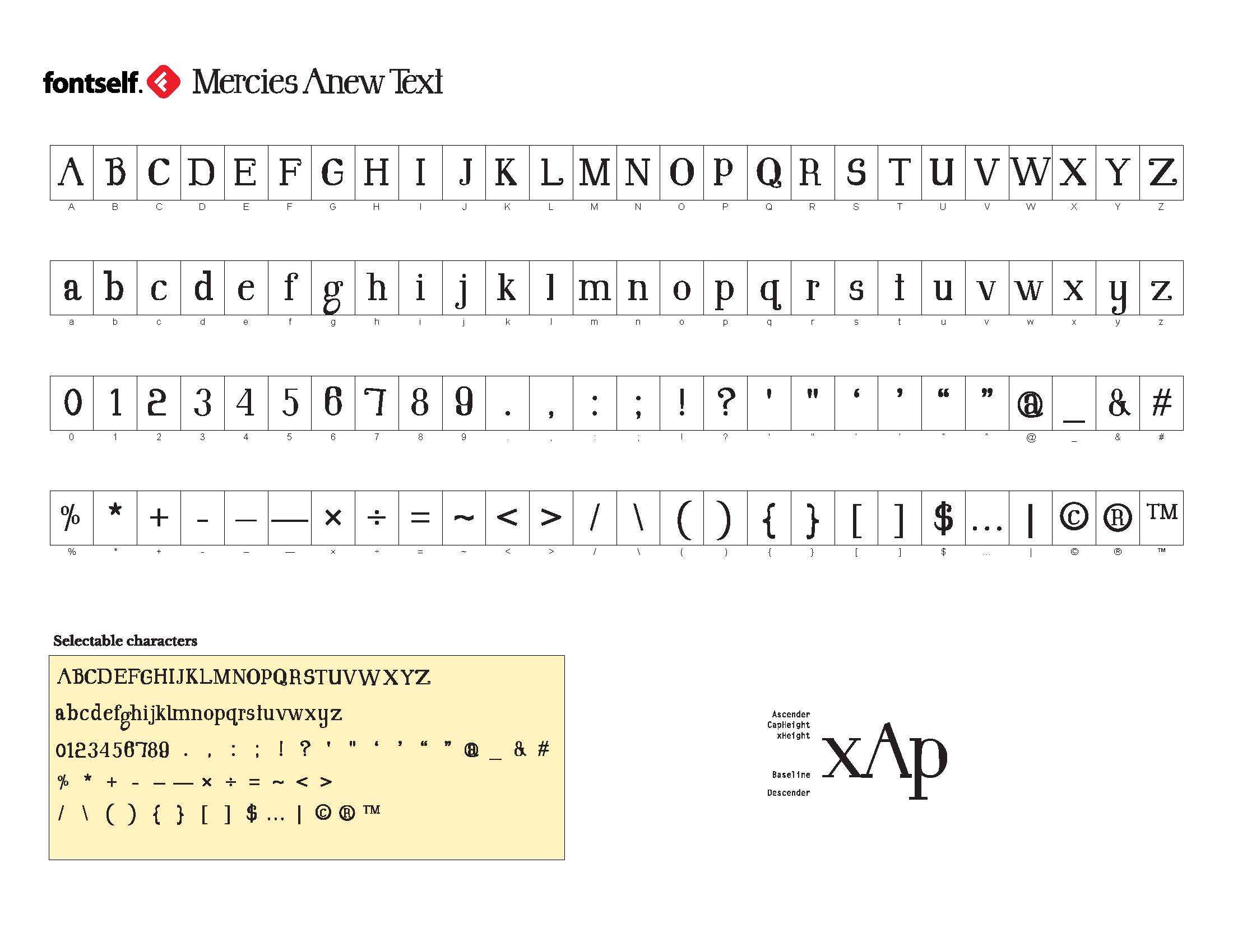
Here is a typeface design created in a Typography course through Liberty University! The Typeface is Mercies Anew, a modern typeface classification. The modern typeface classification is elegant with a rich history, and has lots of room for creativity for creating my own typeface. Five typefaces under this classification that I will use for reference are Bodoni, Didot, Ambroise, Kepler Std, and Arapey. These typefaces helped my decisions in designing under the modern typeface classification.
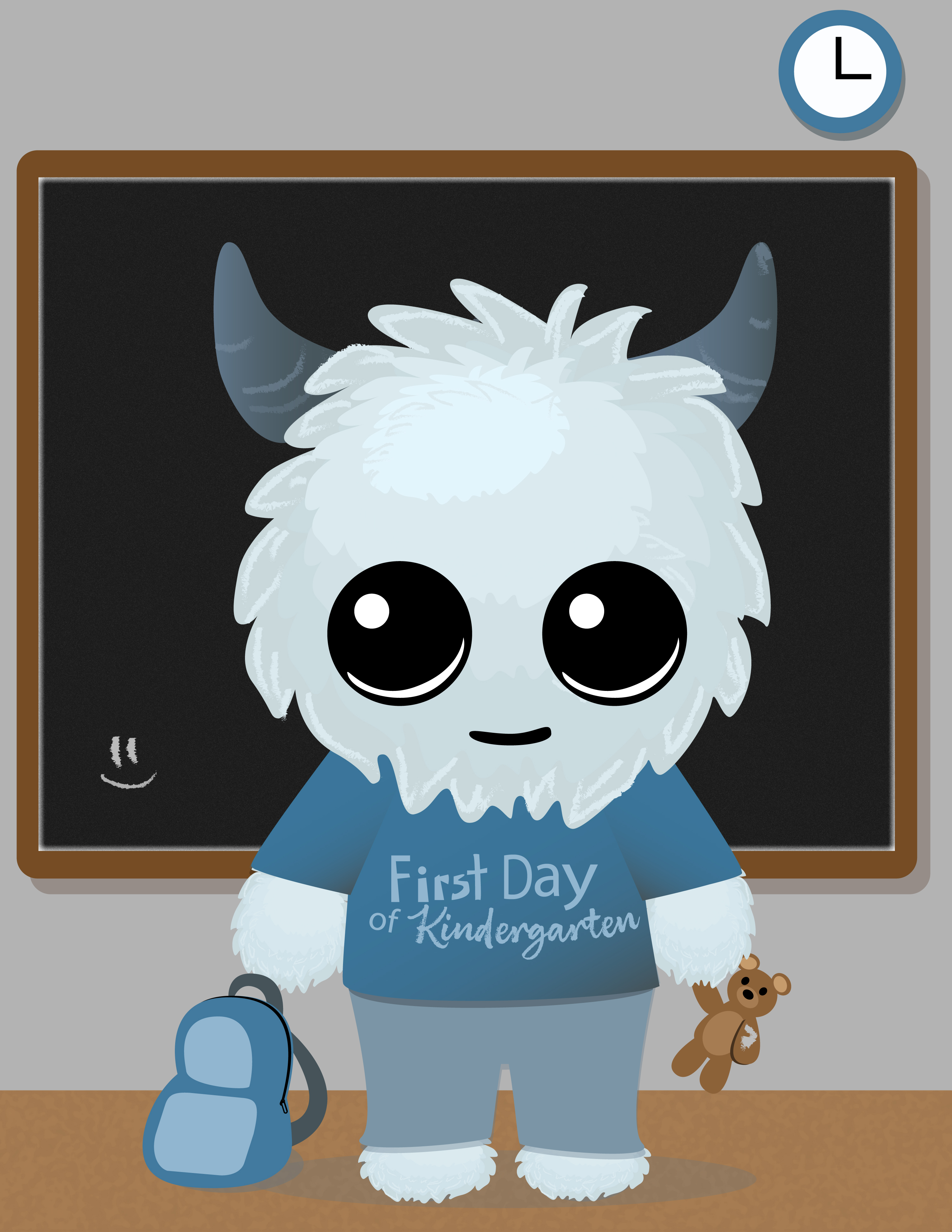
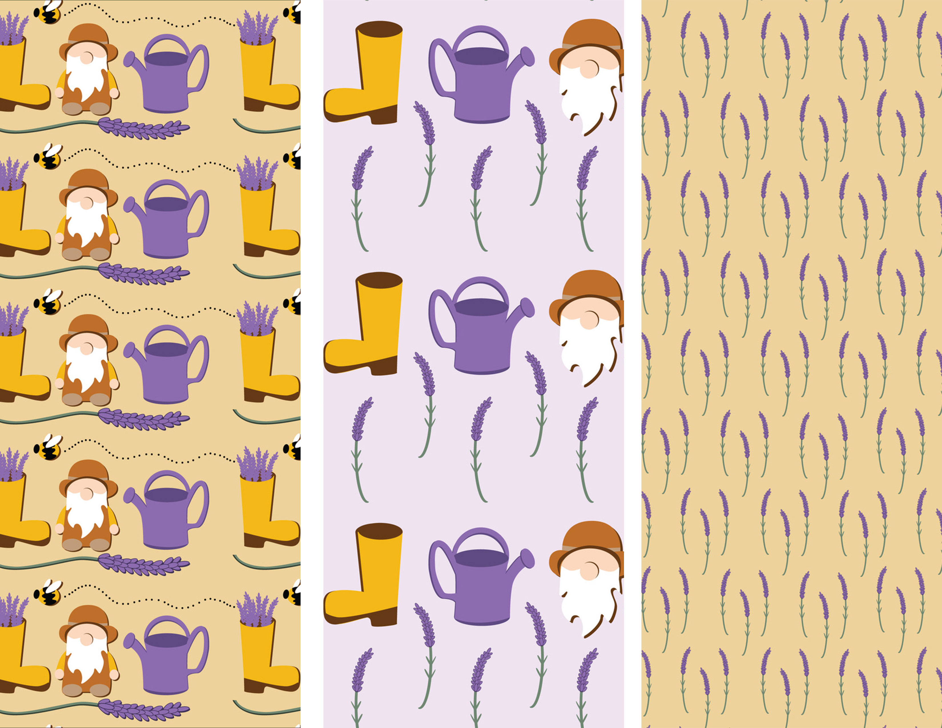
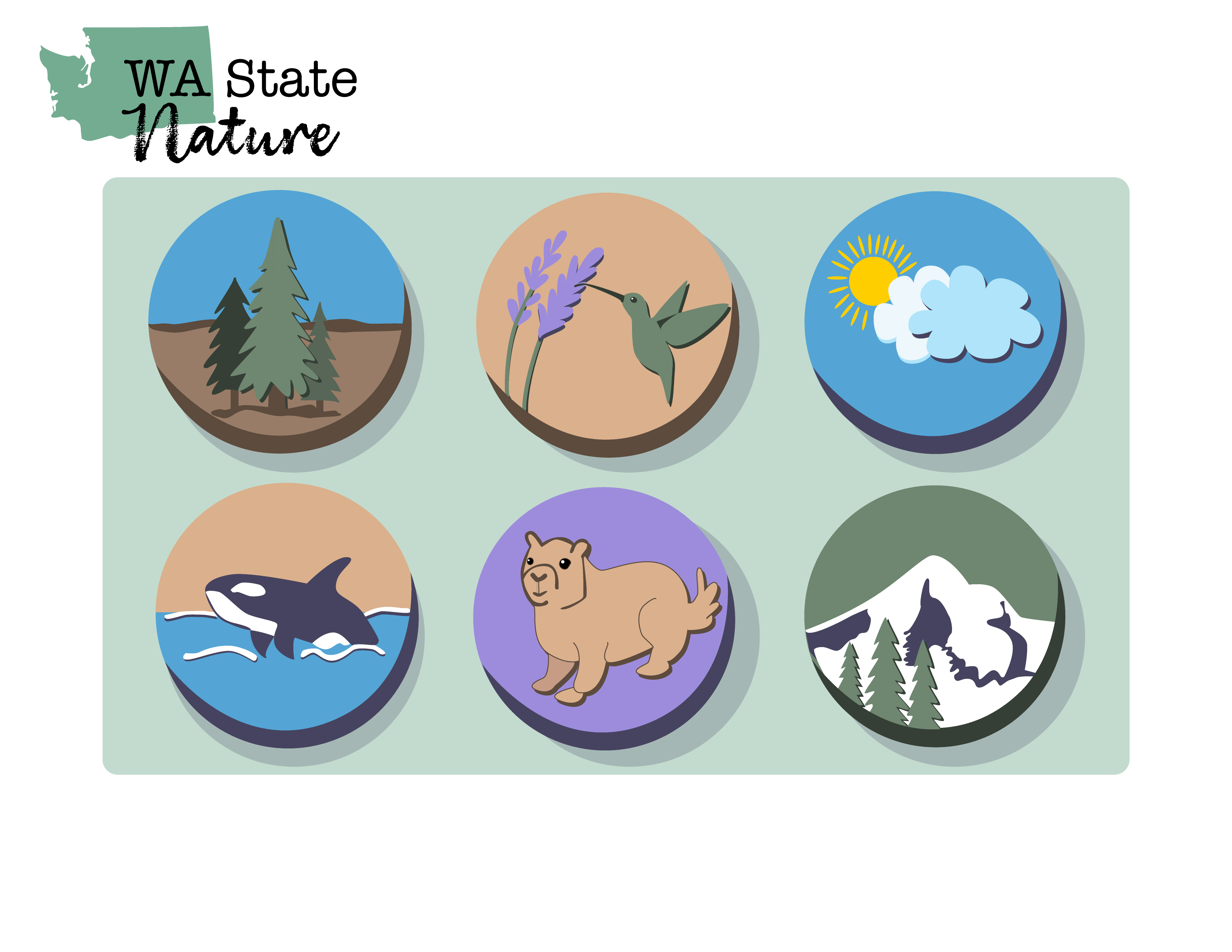

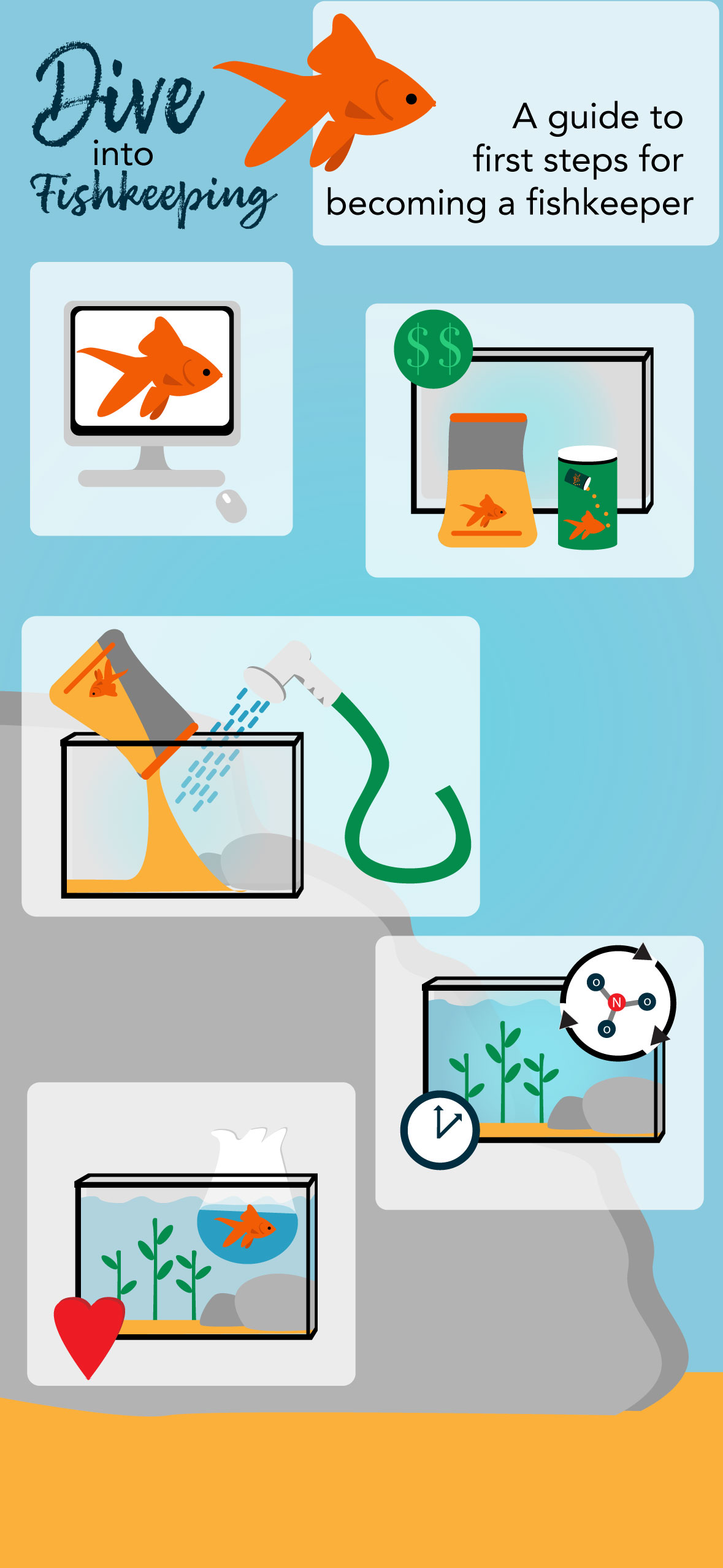
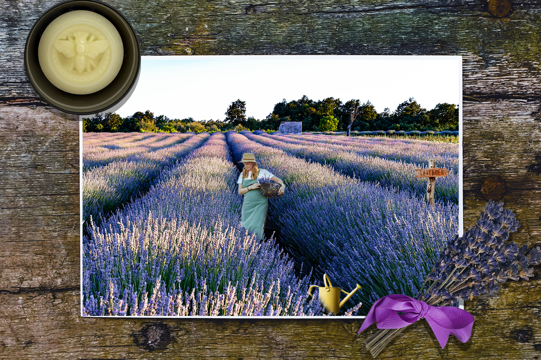
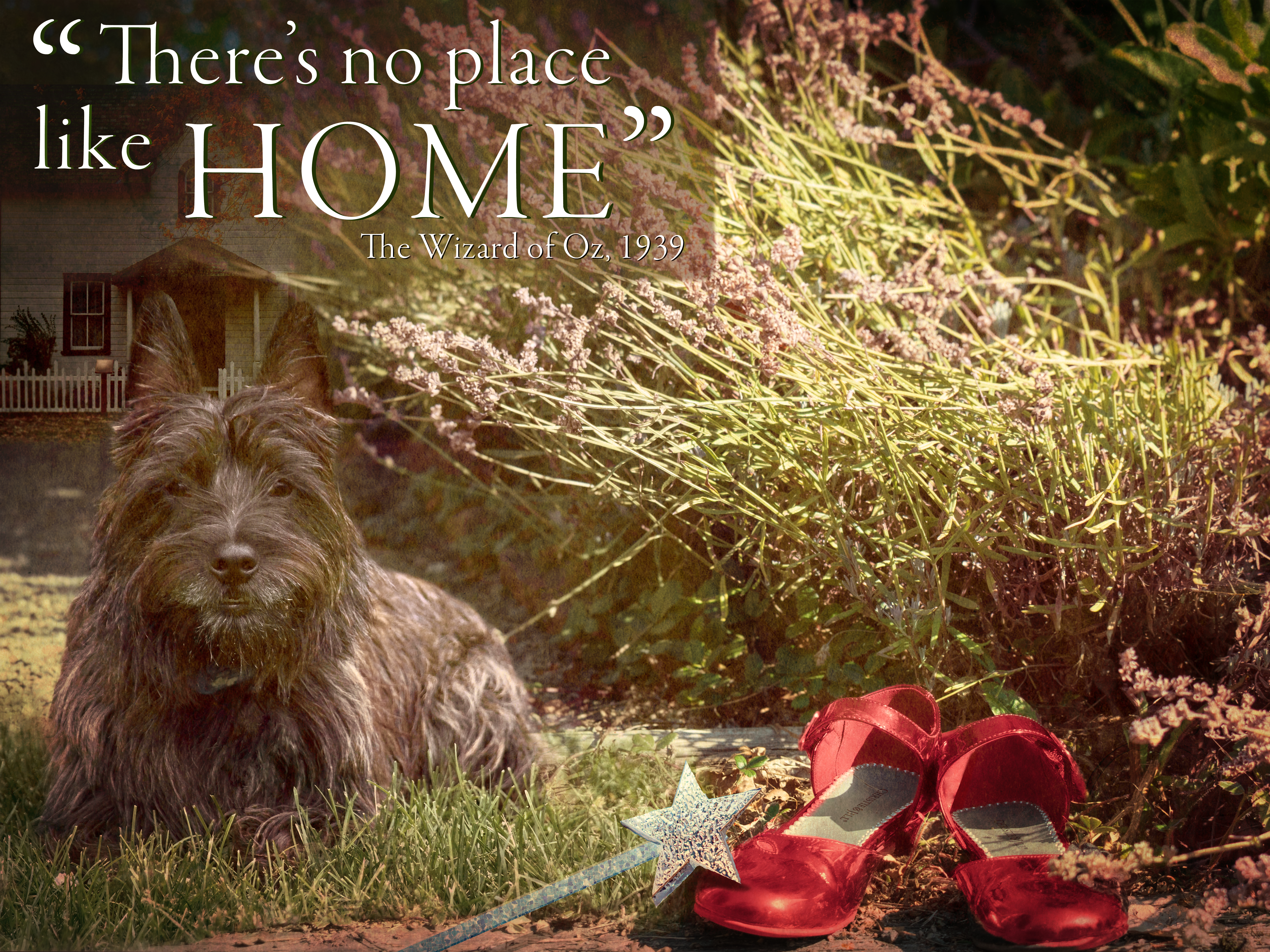
These projects are the fun ones, mostly vector illustrations, and a couple of fun Photoshop projects. All of the following projects were done during Liberty University, and they each had special requirements. The little yeti monster is Freddie, a character designed during Vector Illustrations. The icons, infographic, and pattern were also created during Vector Illustrations. The Photoshop posters and images were all composited using Adobe Photoshop for Digital Imaging. These two courses were probably my favorite so far, and I really enjoyed the projects and creations that were produced during that time of learning.
Curious how Entrusted Design came about? Check out the Process Book journey of how Entrusted Design went from an idea to a reality. This eight-week project in the course Graphic Design I greatly impacted my branding.
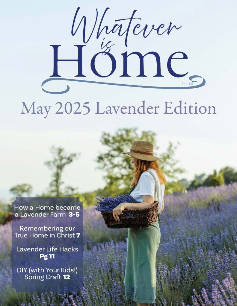
Click the link to see the whole publication design! This publication was an eight-week Liberty Course project. The project emphasized alignment of images and type, making sure to create with the proper bleeds and CMYK color schemes. Note: the project uses filler text.

